StackTrack
Fixing the lack of growth and skill visibility in a company
Impact
Created a skill tracking tool aiming to increase employee talent visibility and simplify project coordination for management. Initial acceptance when showcasing the demo was high, with several managers expressing urgency to gain access.
Client: Public Cloud Group
Role: Lead Designer
Duration: 3 months (2026)
Status: In Development
Issue
Skills and project knowledge lived across disconnected systems, resulting in a lack of growth and skill visibility, unclear hiring needs and underutilization of available talent.
PCG needed a centralized tool that increased organizational efficiency and employee development centered around collaboration and growth.
Goal
Creating a platform that supports organizational efficiency and employee development by building an accessible, fun community centered around collaboration and growth. StackTrack should cut down on project staffing time, increase overview on how projects are going and make users' skills and efforts clearly visible, thereby increasing motivation to develop new skills.
Key User Journeys.
The biggest issue we identified for managers was finding the right people for jobs. Without a central database for projects, clients, and employee skills, project staffing was done by asking around or being lucky to already know the people with the required skills. Staffing projects was taking days for small projects and up to two weeks for larger ones. Additionally, tracking down project details was difficult because leaders used inconsistent management systems.For employees, a lack of skill visibility made career growth feel impossible and discouraging. Furthermore, finding mentors to help expand their skillsets was largely a matter of luck.

Getting the Ball rolling.
We initiated the ideation phase by leveraging Claude AI to rapidly explore visual and UX concepts, as a way to test the tool for potential future use in similar projects. We took what worked and discarded what didn't, using them as a basis for low-fidelity wireframes.


Building the System.
We aimed for a clean, lightweight visual identity, using rounded corners and a minimalist layout accented by just a strategic pop of color. To add some depth and visual interest to the otherwise highly focused interface, we initially experimented with subtle gradients for skill designations to elevate the clean aesthetic. This was quickly dissregarded due to accessibility concerns.Using Figma's Variables feature, we built a system of base colors used to easily map Lightmode and Darkmode equivalents to each other. For the primitives, we mirrored Tailwind's system to ensure ease of use and implementation for the development team.


Testing and Iteration.
"Once the interactive prototype was ready, we ran usability tests with five participants, using task sheets and follow-up questionnaires. Our goal was to evaluate UI clarity and ensure the overall experience was accessibe.Identified issues
Accessibility: The skill-level colors failed to work as intended. Four participants struggled with legibility, indicating an accessibility issue.
Feedback Cycle Confusion: All five participants experienced friction with Feedback Cycle participation and confusion on its status.
Dashboard Misalignment: The dashboard missed the mark on user expectations. Four out of five participants couldn't find the information they actually came looking for.
Copywriting Choices: Two participants mentioned that using the term 'Master' felt outdated and uncomfortable.
Polish.
These final screens served as the blueprint for our development team. To ensure a highly inclusive product, the interface adheres to WCAG 2.2 Level AA accessibility standards. Along with the design assets, I delivered detailed documentation to the developers, highlighting specific implementation notes to safeguard accessibility during production.

Login
Dashboard
Skill Explorer
Skill Detail
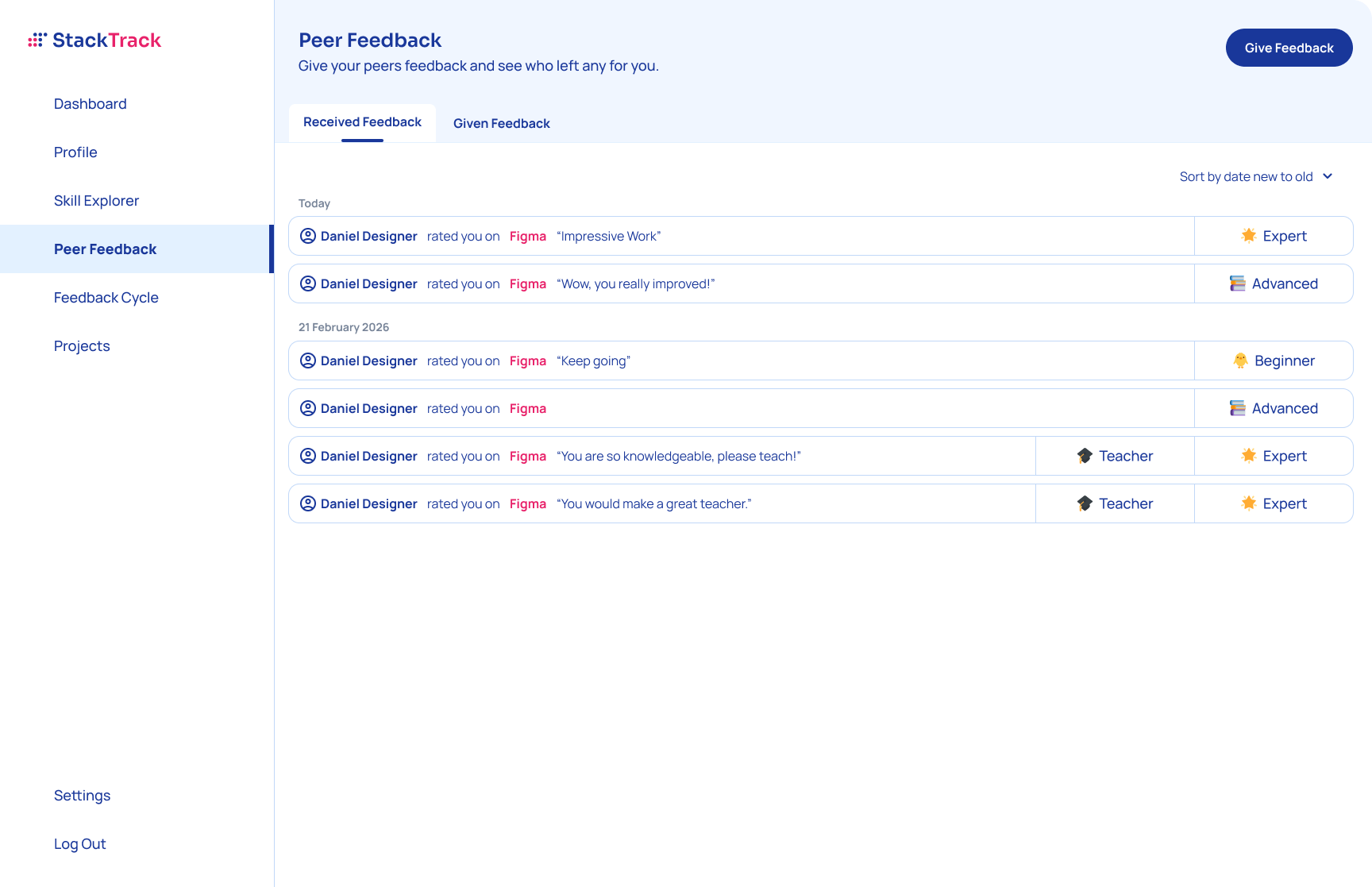
Peer Feedback
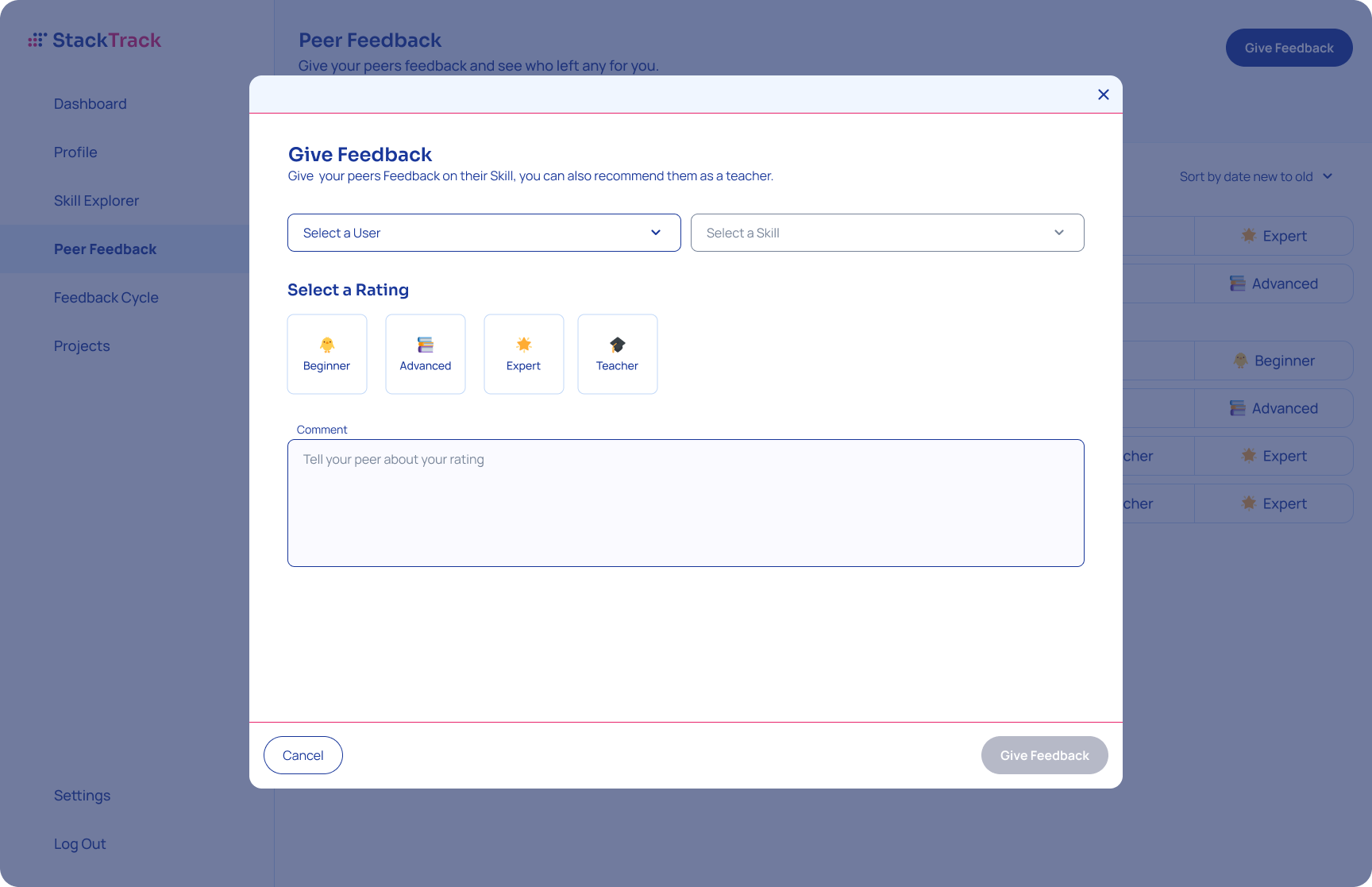
Give Feedback Overlay
Feedback Cycle
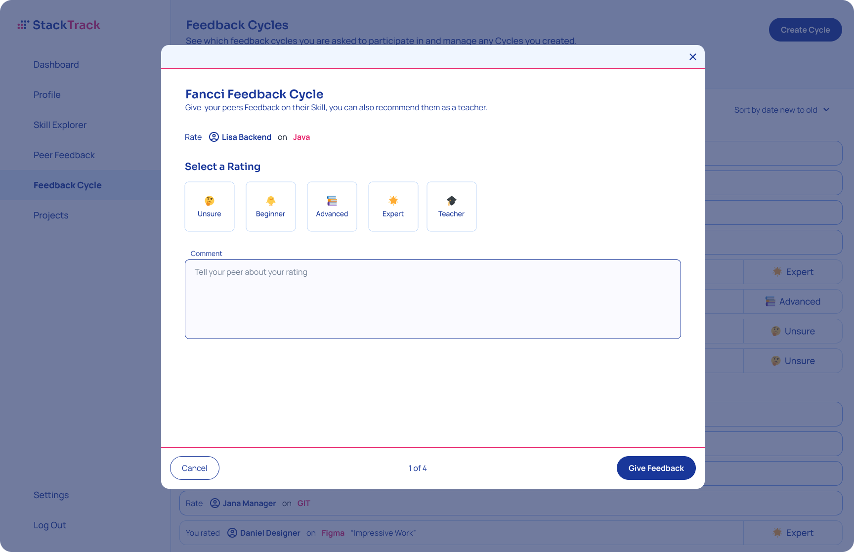
Feedback Cycle Overlay

Projects
Profile


Takeaway.
This project reinforced several key principles that will shape my approach to future product design challenges:
Testing Assumptions Early Saves Engineering Time: Uncovering critical flaws in the dashboard layout and feedback cycle with just five users proved how vital early testing is. Validating the prototype before handoff allowed us to pivot quickly, preventing costly design debt and development rework.
Accessibility is a Foundation: The failure of our initial skill-level color coding was a reminder that even an accessibility-focused designer will not catch every issue. True WCAG 2.2 compliance means baking accessibility checks directly into our design process.
UX Copywriting Dictates Product Tone: The feedback regarding the word 'Master' highlighted that microcopy carries immense weight. Content design must be evaluated just as closely as layout structure to ensure the product feels inclusive and welcoming to all users.
Involvement.
My Contribution:
Product definition and strategy
Stakeholder interviews
Brand direction
Design system
Low-fidelity wireframes
High-fidelity prototype
Usability testingCollaborators:
PCG Development Team
Other PCG Designers
Interested?
Let's talk.
Impressum
Quinn Alex Dier
Dorotheenstr. 31
40235 DüsseldorfTel: +491709065893
E-Mail: [email protected]